+1-917-403-5687,
Responsive web design (RWD)

Redesigning your site for mobile devices...
Do you really need a dedicated mobile website?!
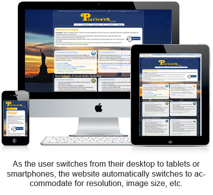
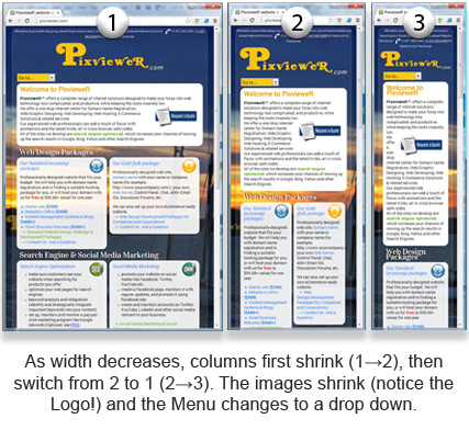
If you already have a website, and tried to access it on one of the latest mobile devices, you know that most mobile browsers scale HTML pages to the viewport width so it fits on the screen. This means the users will have to resize, pan, and scroll around to see your pages. A solution to this is to create two websites - one for desktop, and the other for mobile sites (you probably have already seen .mobi sites). But having a dedicated mobile site is costly, as you will need a separate content strategy for mobile users and all the extra work that goes into it. Another way is to go with a Responsive Design, which is great because you can create a consistent user experience for all devices, without having an extra site just for mobile users.
The advantage of the Responsive Design is that as the user switches from their laptop to iPad or smartphones, the website automatically switches to accommodate for resolution, image size and scripting abilities. In other words, the website designed with a Responsive Layout has the technology to automatically respond to the user's preferences. This would eliminate the need for a different design and development phase for each new gadget - one design for the BlackBerry, another for the iPhone, the iPad, netbook, Kindle etc.
 Contact us to learn how we can redesign your site into a well developed responsive site