Mobile Armageddon & Mobile-friendly Rankings
Mobile-friendly websites and its effect on Google ranking
Google mobile-friendly rankings
You might have already seen headlines screaming “Are you ready for Mobilegeddon? Google’s deadline is April 21st,” “Be Careful with Google’s Mobile Armageddon” and “Your website is doomed if it is not mobile-friendly.”
However, unlike Google’s earlier algorithm changes, websites can upgrade their level of mobile-friendliness whenever they want, in an effort to list their websites on a top spot. April 21st deadline is just the date for the algorithm to roll out, and not a date that your website will disappear from Google SERPs! What you need to know:
- If you already have a mobile or mobile-friendly website, you shouldn’t see a drop in rankings due to this update
- Understand that this change is for mobile search only and will not affect your tablet or desktop rankings even if your site is not mobile-friendly
- It still makes a big difference as only smartphone searches contribute to half of the Google searches!
- Check your pages with the Mobile-Friendly Test
- Mobile friendly feature is only one of many different criteria that Google uses to rank pages, not the ONLY one
- Most importantly, websites can adjust on the fly!
So to recap, Google isn’t suggesting that non-mobile websites will completely disappear from the rankings in mobile searches, but they will most certainly be penalized for not being mobile. If your site is not mobile-friendly, and is on the top of SERPs today for mobile search, the drop after April 21 could be substantial – especially when you consider the fact that websites listed on the top usually get 20% to 30% of clicks and then there is a big drop observed for those placed on second or third position (5% to 10% of the clicks) and all the websites listed below these positions don’t even get 1%.
Can I have a “mobile-friendly” site and still be penalized?
There are some quick fixes (like using Wptouch) to make your site mobile-friendly, but there are plenty of factors you need to be aware of:
- having Mobile “unfriendly” software like flash will be detrimental to your rankings
- the text on your website should be sized to be easily read without zooming in
- the site should automatically resize to the device so users can read content without flipping, scrolling, or zooming
- all links should be large enough and far enough apart for your site to be deemed user-friendly
After completing the Mobile-Friendly Test, head over to PageSpeed Insights to get a more detailed report.
What PixvieweR™ can do for you:
We will check your site and will let you know different ways to get your site mobile-friendly. Based on your budget we will implement the easiest of fixes, or do a complete redesign. While the first will give you some temporary reprieve from plunging rankings, the second will make your site better for all-round ranking increase, if you factor in the other tweaks we will be implementing for you, that is apart from just making the site mobile-friendly.
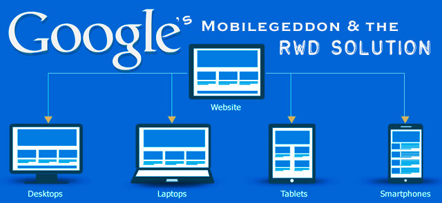
While adding a mobile friendly version or plug-in to your site sounds like the solution, it is not the same thing as having a proper Responsive design. Most Developers and SEO professionals agree that a single Responsive design is the best possible solution. And we will make it happen!
The Bottom-line: Mobile is the future and ignoring that is business suicide. Get mobile-ready as soon as possible and keep improving your mobile presence. You’ll be much better for it in the long run.
We use the latest industry standard professional design tools. We have a broad range of web experience from simple static web sites to dynamic database driven sites that work on all devices and platforms. PixvieweR™ has in-house skills to define your requirements, and develop them into creative and usable solutions. Contact Us →