Advantages of the RWD
Do you really need an expensive dedicated mobile website, or is Responsive Web Design enough?
If you already have a website, and tried to access it on one of the latest mobile devices, you know that most mobile browsers scale HTML pages to the viewport width so it fits on the screen. This means the users will have to resize, pan, and scroll around to see your pages. A solution to this is to create two websites - one for desktop, and the other for mobile sites (you probably have already seen .mobi sites). But having a dedicated mobile site is costly, as you will need a separate content strategy for mobile users and all the extra work that goes into it. Another way is to go with a Responsive Design, which is great because you can create a consistent user experience for all devices, without having an extra site just for mobile users.
The advantage of the Responsive Design is that as the user switches from their laptop to iPad or smartphones, the website automatically switches to accommodate for resolution, image size and scripting abilities. In other words, the website designed with a Responsive Layout has the technology to automatically respond to the user's preferences. This would eliminate the need for a different design and development phase for each new gadget - one design for the BlackBerry, another for the iPhone, the iPad, netbook, Kindle etc.
Stay one step ahead of the competition
The Concept Of Responsive Web Design
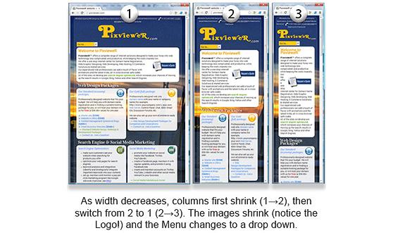
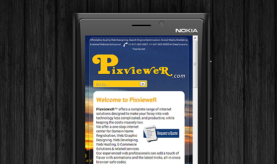
How Responsive Layout works...
In Responsive web design (abbreviated to RWD), the site uses a fluid grid crafted entirely through HTML and CSS to provide an optimal viewing experience across a wide range of devices from desktop computer monitors to mobile phones. The Responsive Layout makes reading and navigation easy on the smaller screens of mobile devices and smart phones.
The Responsive Layout is a hybrid of basic Fluid Layout (where the content continually flows or adjusts in a word-wrap fashion as screen width is increased or reduced) and Adaptive Layout (where breakpoints are used to trigger different layouts at predefined sizes). In RWD, there are predefined break points, but in between these breakpoints content will flow to expand or contract.
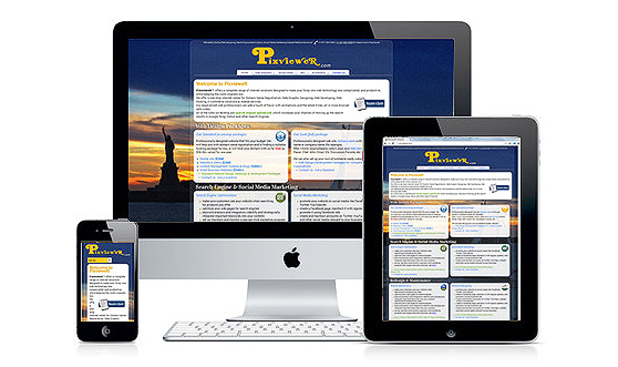
The advantage of the Responsive Design is that as the user switches from their laptop to iPad or smartphones, the website automatically switches to accommodate for resolution, image size and scripting abilities.
See RWD in action!
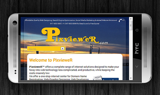
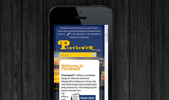
If you are using a desktop, resize your browser to see how this page changes. Notice the images too! You can learn more about the growing importance of Mobile Website Optimization here.
Let your clients see your site properly on any device out there.
Let us redesign your website using the RWD techniques. For a quote or to discuss your needs Contact Us