Website Redesign for Mobile Devices
Is it time to give your current website a new look? Are you thinking of redesigning your site for mobile devices? Our website redesign for mobile devices’ services is just what you need if you are looking to add new functionality, update your content, or a more elegant look for your website. We can redesign your existing website(s) to add Responsive web design (RWD) functionalities. Create a consistent user experience on all devices, so that you don’t have to worry about a majority of your visitors losing out on the content of your website, because the code is outdated.
Stay one step ahead of the competition: Read more about the growing importance of Mobile Website Optimization.
Responsive Web Design (RWD)
What is a Responsive Web Design? The advantage of the Responsive Design is that as the user switches from their laptop to iPad or smartphones, the website automatically switches to accommodate for resolution, image size and scripting abilities.
Google’s ‘Mobilegeddon’ Facts
Google released sweeping changes to its search algorithm on April 21, 2015, giving mobile-friendly websites a boost on smartphones. In its mobile search results, Google now favors websites that adjust for smaller screens. The top spot on a search page typically attracts 20% to 30% of the page’s clicks, positions two to three generate 5% to 10% of the clicks, and links below that receive less than 1% of users’ attention. Websites with unplayable videos, slow mobile pages and blocked image files will get knocked down a peg, which could have serious implications on your business.
Unlike previous algorithm tweaks, websites can upgrade their “mobile-friendliness” at any time to appear higher in Google’s search results — it doesn’t have to be done by the deadline. If you haven’t made changes to your site, this means you still have time. Contact us and we can help convert your site into a mobile-friendly website.
Mobilegeddon is upon us!
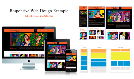
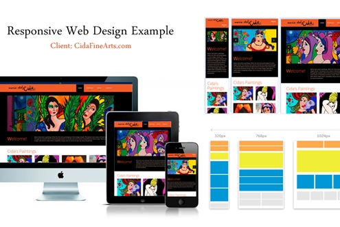
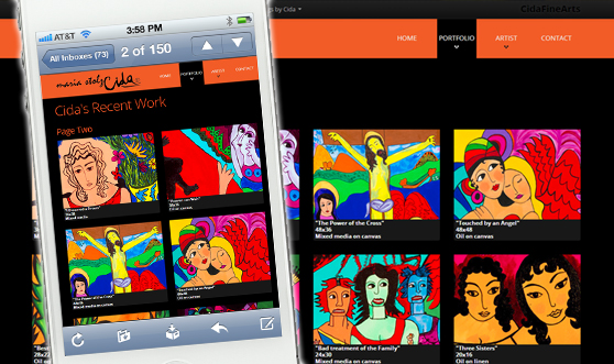
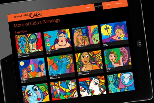
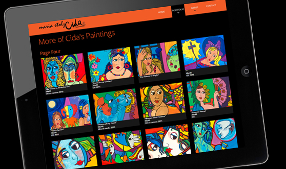
A RWD site designed by Pixviewer
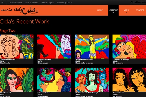
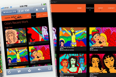
Here is a website that is “Responsive”. It is mobile-friendly, and works seamlessly on all platforms and devices.
Why RWD?
Responsive website design is strongly recommended by Google, as duplicate content on separate mobile site is not required if you use one design (the RWD) for all devices. This also translates into easier site management, and more focussed SEO as you will have to deal with less pages. This means you will be saving time as well as cost on the developmental front.
From the users point of view, they can view a particular site/page on different devices and so there is continuity when they switch devices. Also, there are less features that might compromise the website’s functionality as well as the content when it appears on different devices – thereby resulting in less bounce rate (the percentage of site visitors who leave after visiting one page) – which in turn means your customers will spend more time on your site, giving you a better chance to showcase more of your products.
RWD pages, done properly, can also significantly reduce page load speeds – which would guarantee your site better search engine placements.
See RWD in action!
If you are using a desktop, resize your browser to see how this page changes! You can learn more about the advantages, and concept of RWD here.
Let your clients see your site properly on any device out there.
Let us redesign your website using the RWD techniques. For a quote or to discuss your needs, contact us:

